

How to Choose the Right Fabric Texture for Your Interior Design Color Scheme
Choosing fabric texture is crucial in interior design, yet often overlooked compared to color schemes. Texture brings depth, warmth, and contrast, influencing the space's emotional tone and aesthetic cohesion. Discover how pairing the right textures with your color palette can transform your interiors into inviting, stylish havens.

Why Texture Matters in Interior Design
When designing a space, the focus often falls on color choices, but texture is equally important for a well-rounded design. Texture determines how a surface looks and feels, enhancing the overall aesthetic and emotional impact of a room.
Warmth: Textures like wool or chenille add coziness to cool color palettes.
Contrast: Varied textures create depth in monochrome schemes.
Interest: Different textures can add complexity without altering the color story.
Don’t forget to mix in hard textures too—concrete décor is a rising star in modern interiors. Whether it’s a sculptural vase, a minimal tray, or a textured candleholder, concrete pieces offer a raw, grounded contrast to soft textiles. If you're looking to bring this balanced aesthetic home, check out our curated collection of handcrafted concrete décor items—designed to elevate any space with subtle edge.
Start with Your Color Palette
To select appropriate textures, begin by defining your color scheme. Consider whether your colors are warm and earthy, cool and modern, or bold and vibrant, as this will guide texture selection.
Explore color theories and ideas from resources like Color Psychology to understand how colors work together.
Match Texture to Mood
Textures evoke emotions that can either align with or enhance your color-driven mood.
Suggested Combinations:
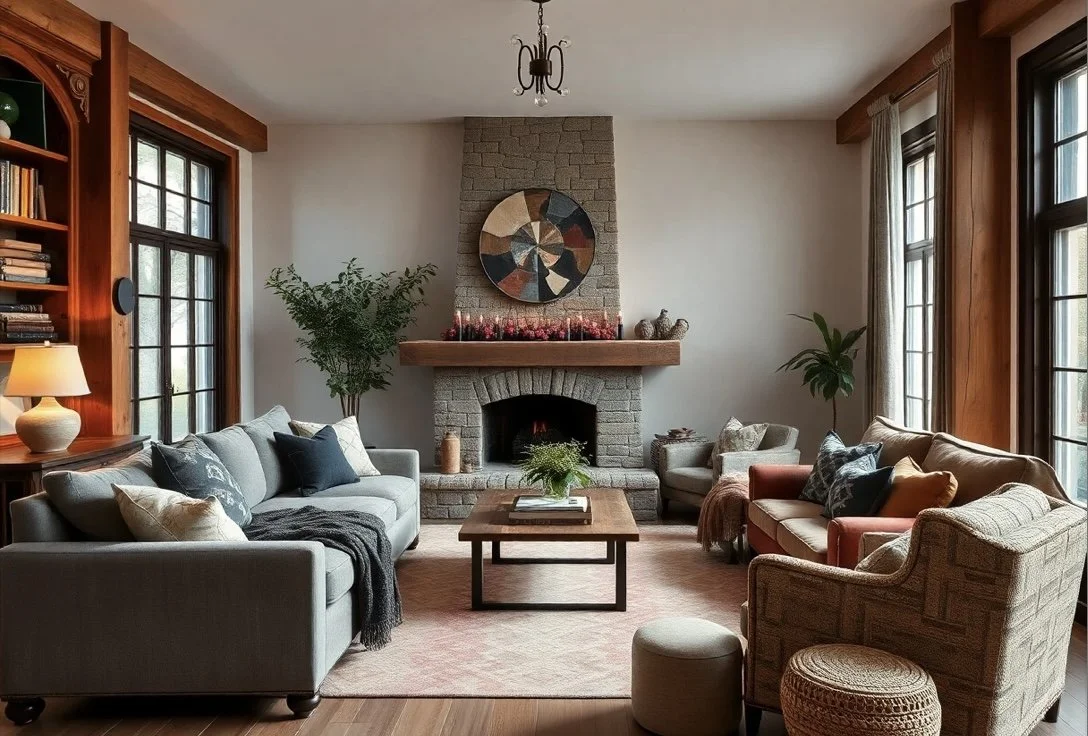
Cozy & Warm: Rust, beige, brown with chenille, wool, corduroy.
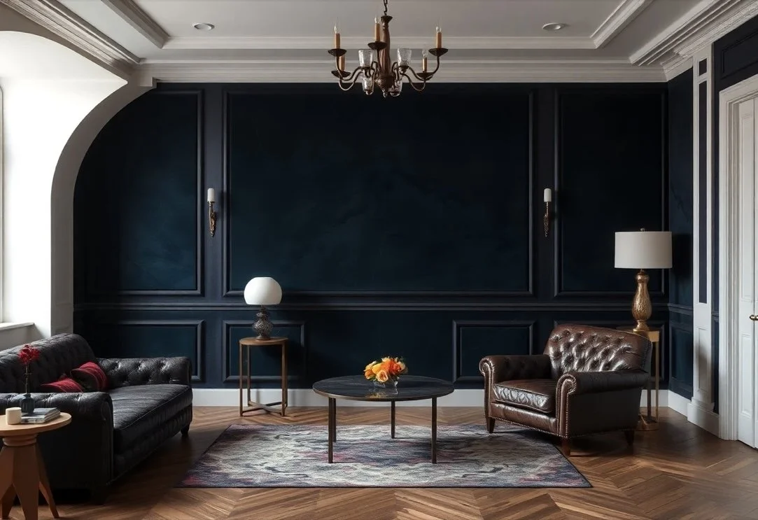
Modern & Sleek: Black, grey, navy with leather, silk, satin.
Soft & Airy: Pastels with gauze, washed linen.
Luxe & Dramatic: Jewel tones with velvet, suede.
Using Texture in Monochrome Schemes
Without color variation, a monochrome or neutral space risks feeling flat. Textures can combat this by adding visual interest:
Layer coarse linen cushions on a smooth sofa.
Drape a wool throw over a leather chair.
Pair shiny silk drapes with matte surfaces.
Balancing Color Saturation with Texture Weight
The saturation level of colors should often be balanced with appropriate textures.
Bold colors: Soften with matte textures like cotton.
Muted tones: Elevate with rich textures like velvet.

Functionality and Durability
Besides aesthetics, consider the practical aspects of textures:
Velvet and silk: Luxurious but better for low-use areas.
Leather and durable fabrics: Ideal for high-traffic spaces.
Sample and Test Before Committing
Always test fabric swatches in your actual room lighting to see how they interact with your chosen colors and textures.
Final Thoughts
Integrating the right fabric textures into your color scheme enhances both aesthetic appeal and comfort. It adds life and dynamism to your space, creating an environment that feels rich and inviting. Remember, the feel of a room matters just as much as its appearance, making texture a vital aspect of interior design.